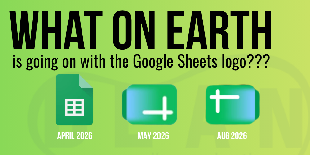
Yikes. Why the rebrand?
Recently, upon a quest to prove digital marketing success in the digital-spanning panels of Google Sheets, I found myself thinking I had a glitch on my Chrome browser tab. As I dug around the page a bit more with my eyes, I darted back and forth, wondering if I myself was the crazy one. This isn’t the first time we’ve seen a funky play on iconic typefaces and iconography from Google. As you know, they’re frequent to changing their daily GOOGLE theme on the classic browser page. Let’s talk about this change and how it shows that even life-altering brands seem to reinvent themselves more frequently than ever.
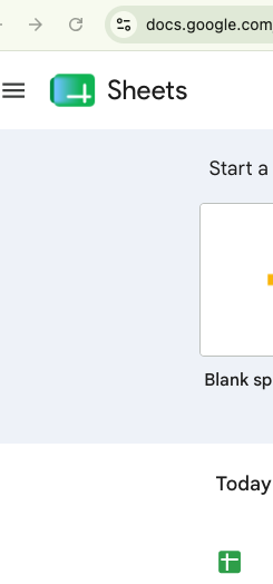
First I thought it was weird that two SHEETS icons were showing at the same time, which they still are.
BUT THEN. I realized there was an additional version in my tabs favicon!
Now we have Dueling favicons! What’s going on!

In order to get to the recent debacle that is the current Google Sheets Icon/logo, we need to back it up. This isn’t the first change, or the last. (hopefully)
Cloud-based Excel
The direct predecessor to Google Sheets was developed by 2Web Technologies to try and bring Excel-like functionality into a web browser. Google bought it in 2005 and released Google Labs Spreadsheets in June 2006. Industries like manufacturing, IT, Technology, Education, Marketing, Accounting would never be the same.
The tool itself is obviously a huge part of life today. An iconic tool. So what are they doing with the new version of the logo?
View on Threads
Hey now! What’s wrong with managing a content calendar… Shots fired..
But seriously. The change completely contradicts the traditional spreadsheet concept by chopping the boxes into an upside-down cross (weird), with some poisonous AI blue toxifying and bleeding over the logo. Complete and utter confusion on my face upon seeing this monstrosity for the first time.
Why Did Google Change the Google Sheets Logo?
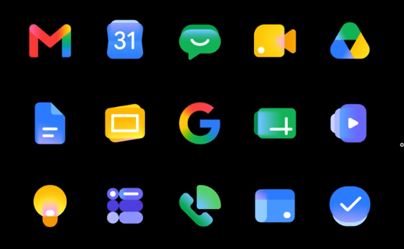
It wasn’t only the Sheets logo. It was every icon in the Google Workspace suite. They moved from flat design (a classic Google staple) to a more modern, fancy melting watercolor gradient style. Not all bad. Some are smooth transitions from old to new.
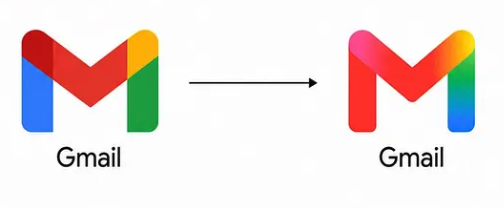
This Gmail mark shifts from the old flat color to the new, and yet, it feels GOOGLY still… Iconic.
This differs greatly from the shift from the old to new Sheets version. This all occurred back in MAY, but just in August Google shifted the SHEETS icon AGAIN. We have ANOTHER UPDATE. In August, Google revealed the version below! Was there some sort of mistake? At the very lease we see a logical reversal.
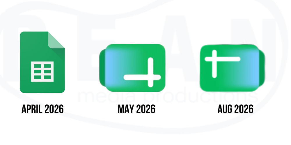
The 180-degree change shifts the start of the spreadsheet back to the top left, where you imagine it going. It begs the question of whether this was a mistake from the get-go.
It also begs the question, however: why?
Why was this necessary? Was this going to help increase users of these tools? Was the motivation to help lift the brand and make it more “AI-friendly”? Stay with the times? Why? It creates a good example of that question, and how in today’s world there seems to be no wrong answer for “why?” Google claims this is the “Gemini” era. Well, the starting pistol of the Gemini era included a stumbling, Bambi-kneed robot impression when it comes to the signified response of the sheets logo. Not the sound, structural titan of industry and lifestyle that Google once represented.
We see marketing minimalization constantly. Coke just recently “rebranded” into a DIFFERENT – “signature” Coke look. Why does so much hinge on these simple fundamentals? Why are so many companies and organizations (look no further than pro sports) constantly trying to reinvent the wheel? Is it not a reminder that the strength of something lies in its actual execution or performance, rather than in its symbol?
I’m all for the mantra of ‘Always be improving,’ but how much does a logo change or refresh really improve your brand? Is it not just a recognition that money, private equity, large entities that inject themselves into classic, organically grown brands, and try to make it more profitable?
Authenticity builds true reputation and character in the eyes of the public.
Is it not a reminder that what once was is not the same?
Despite no change to Google Sheets, the change occurred, but the tool is the same, so why?
The proof is in the pudding when it comes to your brand. The sexiest brand kit won’t fill the coffers. Branding is a vital piece of the marketing puzzle, but not the whole pie. There is so many more factors that can lift your ROI than a minimalization or refresh of your logo. Every case is different, every company is different, but if you’re scrambling for change, look long-term, not short-term.
Sure, a branding update a start… but organizational change, growth, and success rely on consistency, culture, and values. Not shifting those things every time someone feels like it. These changes must reveal true impact and real, consumable understanding of WHY it’s changed.
You can’t just tell someone why it’s changed by making up some fake story; real branding means it encompasses and captures the true essence of a brand. Not a facade. Not a Hail Mary at saving an aging company in a dying industry. It’s certainly confusing coming from Google, such a transcendent entity, being ahead of the curve so often. Rarely do you see a flop like this from them, let alone a potential mistake. The UX errors of having dueling favicons and dueling icons speak to the point I’m trying to make.
Updated brands won’t keep you afloat; professionalism, perseverance, pride, culture, and consistency will. But hey, what do we know?
We’ve talked about it enough. We will live. But gosh. Google is better than this mess.
What are your thoughts on the new Sheets slogo? Let us know what you think at beanteam@beanmediaproductions.com.